
OUR IDENTITY · 2019 → 2026

The story of an apostrophe.

We didn't invent a new logo. We found an idea that was already inside the old one and built a language around it that will last twenty years.

BEFORERezerve'm · 2019
AFTERRezervem' · 2026
INSPIRATIONMichael Bierut · Joan Miró
LIFESPAN2026 → 2046
01 - THE BEGINNING

Rezerve'm: confirmed.

REZERVEM IDENTITY · 2019

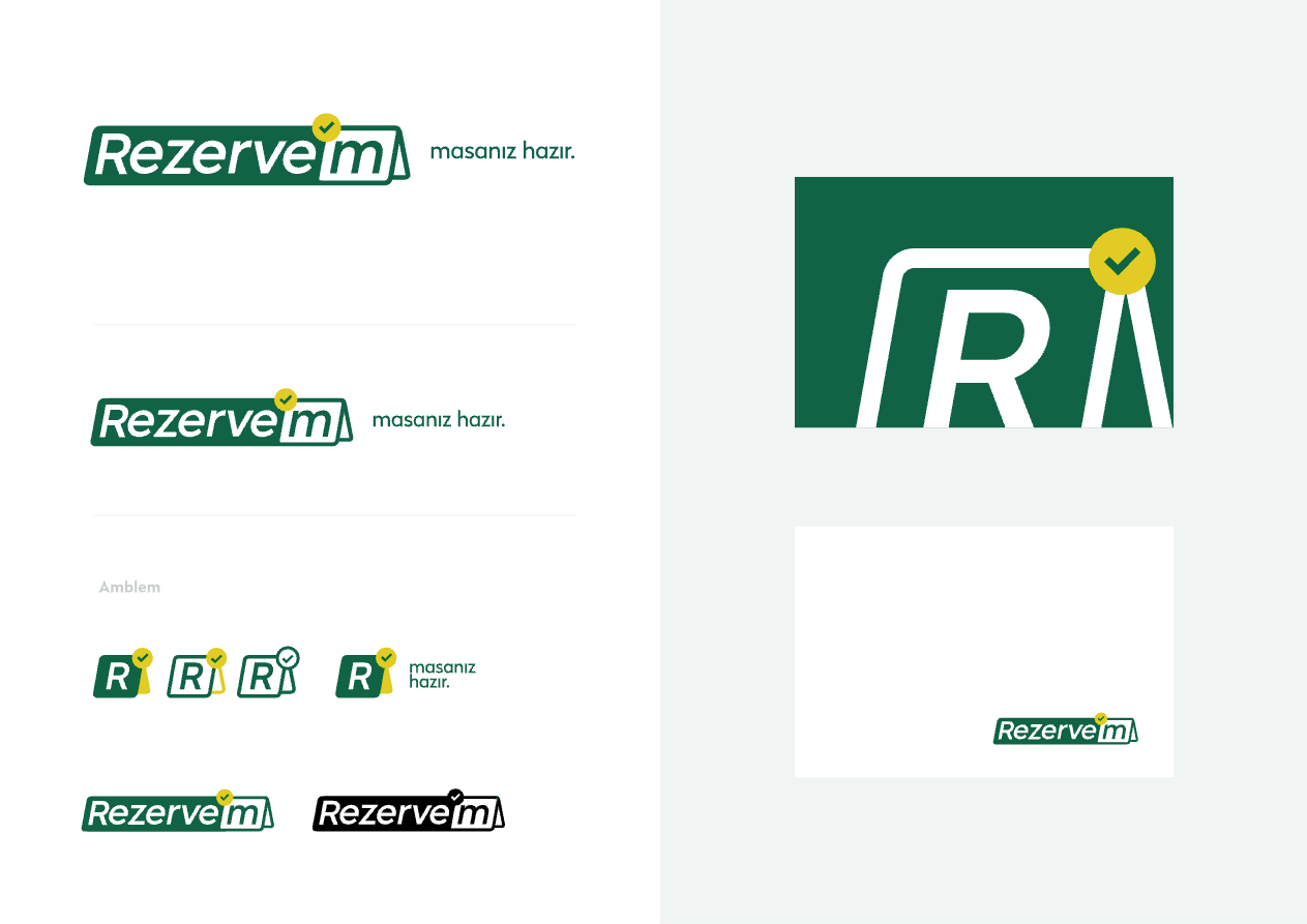
When we started out in 2019, our identity told the story of a single moment: the moment a reservation is confirmed. A green label, italic lettering and a yellow check mark above the apostrophe. It worked well, and it was the identity restaurants knew us by.

COLORGreen (C90 M36 Y82 K29) and yellow (C14 M14 Y98 K0)
MARKA check mark above the apostrophe in "Rezerve'm"
TYPEGotham · Franz Sans · Radikal
STARTED2019
We hadn't noticed: our old logo already carried an apostrophe.
02 - WHY

One product became a platform.

Changing the identity wasn't a matter of taste; it followed from the direction the company was growing in.

From a single product to a product family We started with reservations; today we have a product family that spans Manager to Stay and Pay to AI Concierge. Drawing a separate logo for each would have scattered the family a little more with every new product.
From restaurants to hotels We expanded into hotels, resorts and beach clubs. The italic, framed label spoke of speed; it didn't carry the calm of luxury hospitality.
A language built to last twenty years We wanted a system that works not just today but in 2046 as well: when a new product arrives, we add a new mark, not a new logo.
03 - INSPIRATION

We took the system from Bierut and the spirit from Miró.

Two lessons from two different worlds. One taught us how to build order; the other, the painter our founder has drawn inspiration from for years, taught us how to breathe within that order.

GRAPHIC DESIGNER · SYSTEMATIC INSPIRATION Michael Bierut

Partner at Pentagram; a graphic designer known for the strong, long-lived visual identity systems he has created for large institutions.

The core idea from his work that inspired us:

An identity is not just a logo; it is a way of behaving.

Set the rules up right and the brand doesn't have to be redesigned for every new product. It grows within the same system and gets stronger with every repetition.

  • 01One constant, one variable.The brand stays constant; the products take on their own character.
  • 02Consistency is a design decision.A single typeface family, a strong grid and generous neutral space.
  • 03Clarity, not show.A good mark communicates without having to explain itself.

In our identity: Instrument Sans as the single typeface family, a 12-column grid and a shared mark at the end of every product name.

PAINTER · ARTISTIC INSPIRATION · OUR FOUNDER'S INSPIRATION Joan Miró

The painter who has inspired our founder, Bekir Topuz, for years.

What moves us in Miró's art is that even the simplest forms have limitless expressive power.

A few dots, a star and a line can build an entire sky. Hospitality, too, sometimes becomes an unforgettable experience through the smallest gestures.

  • 01Small marks, big meanings.An original visual alphabet drawn from dots, stars, crescents and trails.
  • 02Little color, lots of rhythm.Empty space is as powerful as form.
  • 03Freedom within order.Making room for creativity, movement and play within a serious, consistent system.

In our identity: 12 original secondary marks, product modules and a trail that flows toward the brand's dot.

Interpreting the inspiration we took from Miró's art in our own visual language turned our founder's personal passion into Rezervem's shared creative world.

An independent design approach. Rezervem's visual identity was developed independently, inspired by Michael Bierut's design approach and Joan Miró's art. There is no design collaboration, sponsorship or endorsement relationship with the individuals named or their rights holders.

Backbone: Bierut. Spirit: Miró.

The system doesn't change: wordmark, product architecture, typography and grid. The Miró layer says what the system says in a slightly more human way; it never takes its place.

04 - THE JOURNEY

A new identity in six steps.

We didn't reach the right answer in a straight line. Each step learned something from the one before.

  1. 01
    Rezerve'm
    2019 Rezerve'm

    Green label, italic lettering, yellow check mark. A logo that told the story of a moment, and worked well.

  2. 02
    R
    EXPLORATION One letter: R

    The first direction rested on a single letter: the stem of the R stayed fixed, with each product's own shape in the counter of its bowl. The system was strong, but the symbol was saying too much.

  3. 03
    R
    PROPOSAL R' - the mark becomes an apostrophe

    At Bekir's suggestion, the module moved to the top right of the R, like an apostrophe. In Turkish, the apostrophe separates a proper noun from its suffix: Rezervem'e, Rezervem'in.

  4. 04
    DECISION Rezervem' - no separate symbol

    In the end we dropped the symbol. The wordmark carries the system on its own: the mark sits at the end of the brand, right where the next thing begins.

  5. 05
    HERITAGE Back to green

    We worked with red for a while, but the color restaurants associated with us was green. When we went back to the old identity, we realized: we hadn't invented the idea, we had found it.

  6. 06
    OCTOBER 2026 Rezervem'

    Green as the primary color, yellow as the secondary. A green mark on light backgrounds, yellow on green and dark backgrounds. One constant, one variable, twenty years.

05 - THE IDEA

The apostrophe: a mark of belonging.

Rezervem's mark sits exactly there: at the end of the brand, where the next thing begins.

In Turkish, the apostrophe separates a proper noun from its suffix and shows what belongs to it. Our mark works the same way: every product is a part of "Rezervem'in" (Rezervem's), and every product name carries its own mark at the end. The old logo's check dot moved to the end of the name in the new system.

Rezervem'e Rezervem'in Rezervem'de Rezervem Manager'ı Rezervem Stay'de
06 - CONTINUITY

What we kept, what we left behind.

KEPT Everything restaurants recognized.
  • Green, meaning "confirmed, ready"
  • The apostrophe dot: the heart of the old logo
  • Yellow: the color of the moment of confirmation
  • The Rezervem name and its guest-focused language
LEFT BEHIND The feel of speed and a label.
  • Italic lettering and the frame
  • Splitting the name in two: "Rezerve'm"
  • A check mark that was illegible at small sizes
  • Three separate typefaces
ADDED A language that can grow.
  • A single typeface family: Instrument Sans
  • A mark of its own for every product
  • A Miró drawing language
  • Motion: the moment of confirmation
07 - COLOR

Green and yellow on a neutral ground.

Green is the color our customers associate with us; it matured into the primary color. Yellow carries the moment of confirmation. Most of the surface is paper and ink; product colors appear only in product marks.

Rezervem Green#106344 · 16 99 68Primary color: the mark, the main action, covers.
Rezervem Yellow#E2CB25 · 226 203 37The mark on green and dark backgrounds, the moment of confirmation.
Ink#161513 · 22 21 19Text and dark surfaces.
Paper#F3F0E8 · 243 240 232Page background.
Product colorsEvery product has its own mark and color; the color lives only in the mark.
Manager#3060E0
CRM#1E86A8
Join#F28BA3
Experience#CF3D86
Connect#22A99E
Pay#EE9F27
QR Order#F27D2C
Hospitality#E2412B
Stay#5AB4E8
PMS#9DB536
Socielty#9A3FAE
Gift#C42C4E
Guest Network#4C4FD6
Partner API#3A3732
AI Concierge#7B55E6
08 - THE FAMILY

One family, one library of marks.

Every product is written as "Rezervem" plus its own name; the product's module sits at the end of the name, where the brand's dot would be. When a new product arrives, we don't draw a new logo; we pick a new mark from the library.

09 - THE MIRÓ LAYER

Our products are already an alphabet.

A scene for every product. The module is the focus of each scene and its only colored element; dots, stars and the trail tell its story. We don't draw human figures, cutlery or arrows: we draw the idea, not the object.

ManagerTHE RHYTHM OF THE EVENING
JoinTHE NEXT GUEST
ExperienceA SPECIAL EVENING
ConnectA MESSAGE WITH CONSENT
PayA SECURED TABLE
QR OrderAN ORDER ON ITS WAY TO THE KITCHEN
HospitalityFROM REQUEST TO TASK
StayTHE STAY JOURNEY
PMSA SINGLE GUEST RECORD
SocieltyA COMMUNITY
GiftA GESTURE AT THE RIGHT MOMENT
Guest NetworkNEW GUESTS
Partner APICONNECTED SYSTEMS
AI ConciergeINTELLIGENCE THAT TALKS TO GUESTS
GLOSSARY OF MARKS

Every mark has a job.

Our drawings aren't decoration; they're a language. Eight marks carry the same meaning in every scene.

Product moduleFOCUS

The focus of the scene and its only colored element. It says which product or subject the drawing is about.

A square for Manager, a ring for Join, an arch for Stay.
TrailJOURNEY

At most one per scene. It connects the pieces and stops at a destination.

From reservation to table, from kitchen to service.
StarVALUE

Marks what is valuable and the special moment.

Reviews, events and special occasions.
CrescentNIGHT

The mark of night and of overnight stays; the other half of the day.

In the sky in Stay scenes; the night team on a shift.
ConstellationWHOLE

Dots joined by a line; it shows that separate pieces form a single whole.

The tables in a dining room, the properties in a group.
RhythmREPETITION

Dots in a row that shrink or grow; continuity and growth.

Visit frequency, waiting guests, rising revenue.
Ground linePLACE

An optional horizon. Used when the scene shows a physical place.

Dining room, hotel, checkout counter.
Tone formDEPTH

A large form one shade darker than the background. It carries no meaning; it gives the scene depth.

Only at medium and large sizes.

The rule is simple: the product is the focus of the scene, the trail is what it tells. The other marks hint at the subject; none of them draws the object literally.

THREE DOSES

How much Miró?

A · ALMOST NONE Product interfaces and documents.
  • A single mark, in stone
  • Only in empty states, confirmations and errors
  • Never in tables, calendars or the table plan
B · MEASURED CHARACTER Web, presentations and social media.
  • One trail and at most two small marks
  • The trail flows toward the brand's dot
  • Ink and paper; no new colors
C · EXPRESSIVE Campaigns, events and launches.
  • Filled forms and constellations
  • Ink and a single product color
  • Time-limited; withdrawn when the campaign ends

One constant, one variable, twenty years.

Logos, colors and usage rules are in our brand kit.